
EGI Check-in Button Configuration for Developers
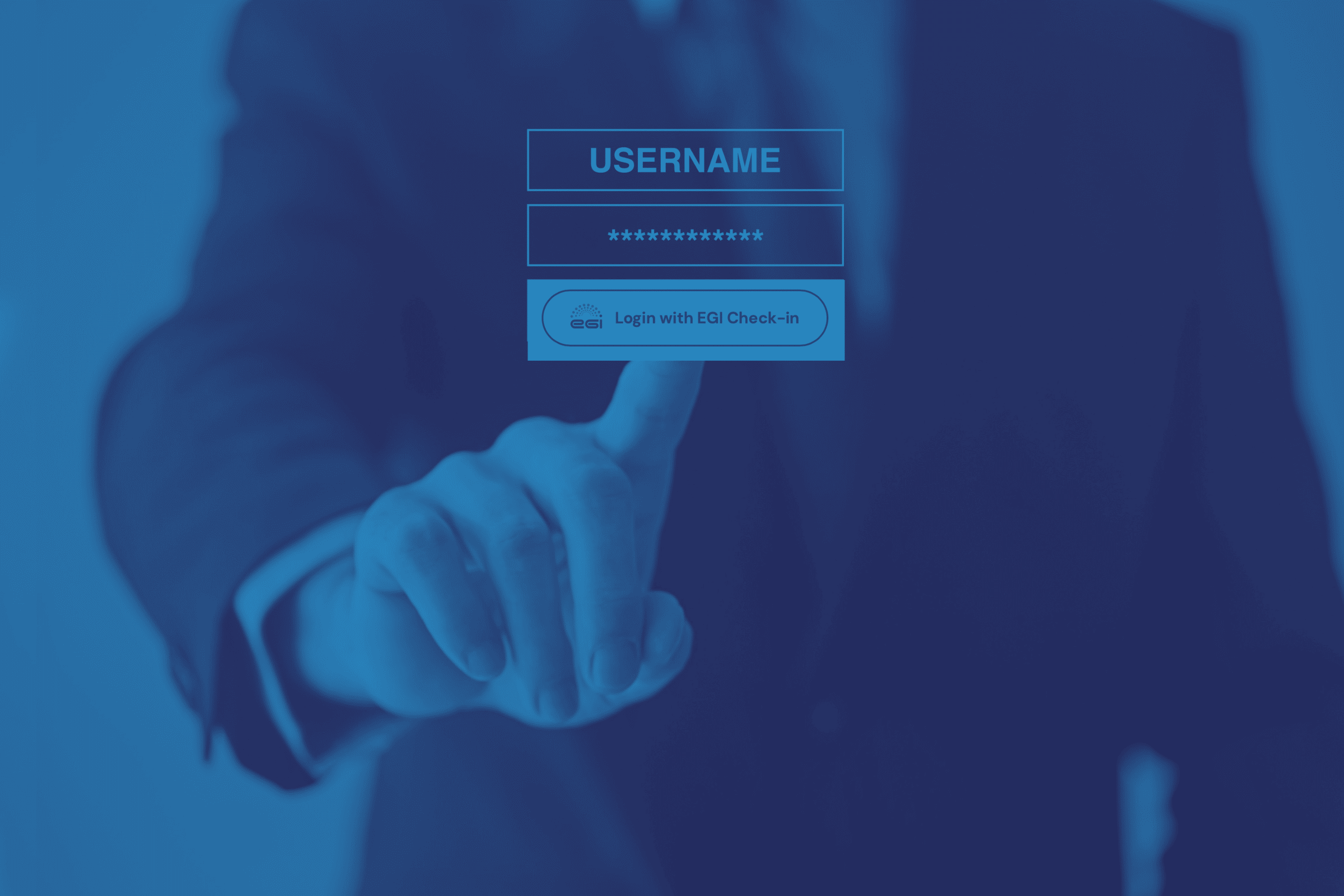
The EGI Check-in Login and Sign-up buttons that come with our Software Development kit are easy to integrate and include built-in guidelines that ensure a consistent design and experience across different apps and systems using the EGI Check-in service.
Assets
format: svg file
Right click this file and select download.
format: svg file
Right click this file and select download.
Typeface
format: google fonts or local
Connect your application to Google Fonts. Or- if your application supports local typefaces, you can download it from Google Fonts and host it on your server.
Button Blue Border
HTML Code
<a href="#linkhere" class="button-blue-border">Sign in with EGI Check-in<a>
<a href="#linkhere" class="button-blue-border">Login with EGI Check-in<a>
<a href="#linkhere" class="button-blue-border">Continue with EGI Check-in<a>
HTML Code
<a href="#linkhere" class="button-blue-border">Sign in with EGI Check-in<a>
<a href="#linkhere" class="button-blue-border">Login with EGI Check-in<a>
<a href="#linkhere" class="button-blue-border">Continue with EGI Check-in<a>
Styling CSS Code
.button-blue-border {
  display: inline-block;
  width: auto;
  margin: 20px 20px 0px 0px;
  padding: 20px 30px 20px 80px;
  border: 2px solid #005faa;
  border-radius: 100vw;
  background-color: #fff;
  background-image: url(../assets/egi-logo-color.svg);
  background-position: 30px 43%;
  background-size: 36px;
  background-repeat: no-repeat;
  -webkit-transition: all 200ms ease-in-out;
  transition: all 200ms ease-in-out;
  font-family: 'DM Sans', sans-serif;
  color: #005faa;
  font-size: 18px;
  font-weight: 700;
}

.button-blue-border:hover {
  background-color: #005faa;
  background-image: url(../assets/egi-logo-white.svg);
  color: #fff;
}
Approved Usages

When the button is displayed next to other login options, you are free to match the border radius and size to those buttons to display a more uniformed interface.
Button Blue Background
HTML Code
<a href="#linkhere" class="button-blue-background">Sign in with EGI Check-in<a>
<a href="#linkhere" class="button-blue-background">Login with EGI Check-in<a>
<a href="#linkhere" class="button-blue-background">Continue with EGI Check-in<a>
HTML Code
<a href="#linkhere" class="button-blue-background">Sign in with EGI Check-in<a>
<a href="#linkhere" class="button-blue-background">Login with EGI Check-in<a>
<a href="#linkhere" class="button-blue-background">Continue with EGI Check-in<a>
Styling CSS Code
.button-blue-background {
  display: inline-block;
  width: auto;
  margin: 20px 20px 0px 0px;
  padding: 20px 30px 20px 80px;
  border: 2px solid #005faa;
  border-radius: 100vw;
  background-color: #005faa;
  background-image: url(../assets/egi-logo-white.svg);
  background-position: 30px 43%;
  background-size: 36px;
  background-repeat: no-repeat;
  -webkit-transition: all 200ms ease-in-out;
  transition: all 200ms ease-in-out;
  font-family: 'DM Sans', sans-serif;
  color: #fff;
  font-size: 18px;
  font-weight: 700;
}

.button-blue-background:hover {
  background-color: #fff;
  background-image: url(../assets/egi-logo-color.svg);
  color: #005faa;
}
Approved Usages

When the button is displayed next to other login options, you are free to match the border radius and size to those buttons to display a more uniformed interface.